At Todoist, code ships continuously: a change goes into a pull request (PR), gets reviewed, gets merged, and deploys once it lands on the main branch. With AI-driven workflows, this pattern is being exercised more than ever. Agents make faster deliveries possible, sometimes with minimal human input, and we can see this reflected in the number of PRs created in our GitHub organization over the last three years: around 20k in 2024, 24k in 2025, and already 23k in 2026. By this point last year we were at roughly 16k, an almost 50% surge!
Such a clear upward trend in PR volume made it even clearer how important it is that the PR loop, from creation to shipment, stays efficient. Leaving human review aside, the time spent on CI until a PR is green should be short. We don’t want to wait when we could iterate or ship changes to users instead.
In the next sections we go over the strategies we adopted to address this. In less than a quarter, we’ve improved the Todoist web app’s production deploys from over 20 minutes to under 10 at the 95th percentile, and CI pipelines from 14 to 8 minutes.
Throwing hardware at it
We set out to tighten our product “feedback loops”. Each team would independently identify inefficient processes in their delivery channels and workflows and come up with a plan to optimize them. A clear target emerged for all: CI and CD times were unbounded, with a wide disparity between platforms, often well into double digits and sometimes close to the hour mark.
On the one hand, we run a lot of things on CI: linting, formatting, unit tests, end-to-end tests, automated reviews, and so on. This is great! It lets us ship with confidence. On the other hand, all of these processes run on every single PR, so they compound, and if left unmanaged they slow CI down over time as more code gets added.
With the general area of improvement identified, the first thing we tried was the easy way out: throw more hardware at the problem. Our CI runs on Ubicloud runners, and they offer a premium tier with faster CPUs, so we switched it on for the main pipelines.

It was turned off again the very next day.
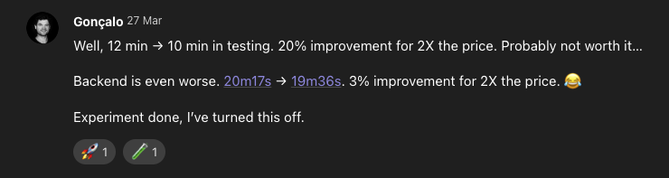
A 20% improvement for double the cost, and barely any improvement at all for the backend. That single experiment set the tone for the entire quarter: the gains were going to come from how we run things, not from where we run them.
Measure twice, cut once
With that initial reality check firmly in mind, it became clear that guessing wouldn’t cut it. We needed real numbers to build a baseline for whatever optimization came next.
Our CI pipelines live close to our PRs, in GitHub Actions, so armed with a quickly hacked-together script that pulled data from GitHub and computed average and percentile workflow times, we got the following numbers for the Todoist Web app:
| March 2026, Todoist Web | PR pipeline | Production deploy |
|---|---|---|
| p50 execution time | 11.9 min | 18.5 min |
| p95 execution time | 14.5 min | 21.7 min |
| Runs under 10 min (execution) | 8% | 1.6% |
We’re going to focus on execution time instead of wall-clock time. The latter is what a developer actually waits for: from the moment a PR is pushed until CI is green. Execution time is the part of that during which a runner is actually doing work. The gap between the two is queue time, the wait for a runner to pick up the job, and that one is mostly out of our hands as it depends on upstream capacity. We kept wall-clock time on the dashboard as a reminder of what the team is actually experiencing but are only optimizing for execution time.
Our goal was for runs of our PR pipeline to take less than 10 minutes. Single-digit production deploys were a secondary priority. In practice this means that, if the review is immediate, a change can be on its way to production within minutes.
As the table shows, fewer than 10% of PRs were running under 10 minutes, so there was plenty of room for improvement. The script, however, wasn’t going to get us there. It wasn’t user-friendly, it didn’t make the results visible to anyone else, it would need to run somewhere remotely on a schedule, and, most importantly, it wasn’t granular enough. It told us the pipelines were slow, but nothing about which jobs were the bottleneck.
Fortunately, Datadog is our main observability platform, and it offers CI Visibility , which tracks pipeline metrics through a GitHub integration and makes them available in its dashboards. A few highlights:
- Per-run breakdowns of each pipeline into its jobs and steps
- Aggregation of individual runs into distributions, so we can work with trends instead of one-off investigations
- A single place where the whole team can look at the metrics
- Access to the same data through Datadog’s CLI and MCP server
The breakdowns were especially useful for tracking down bottlenecks. Rather than focusing on the overall runtime, we focused on the critical path. A pipeline runs several jobs, some of them in parallel, so optimizing the longest job isn’t necessarily the best move if other jobs run alongside it and, chained together, take longer. In that case the critical path is made of those other jobs, not the long one.
In one of our pipelines, static analysis was one of the longest jobs at over three minutes, and it wasn’t on the critical path at all: it ran in parallel and finished before the tests did. Making it faster would have saved exactly zero seconds end to end.
Optimizing the critical path first, for example by parallelizing smaller jobs that were running in sequence, might eventually turn that long job into the critical path. Only then is it worth the effort to optimize it.
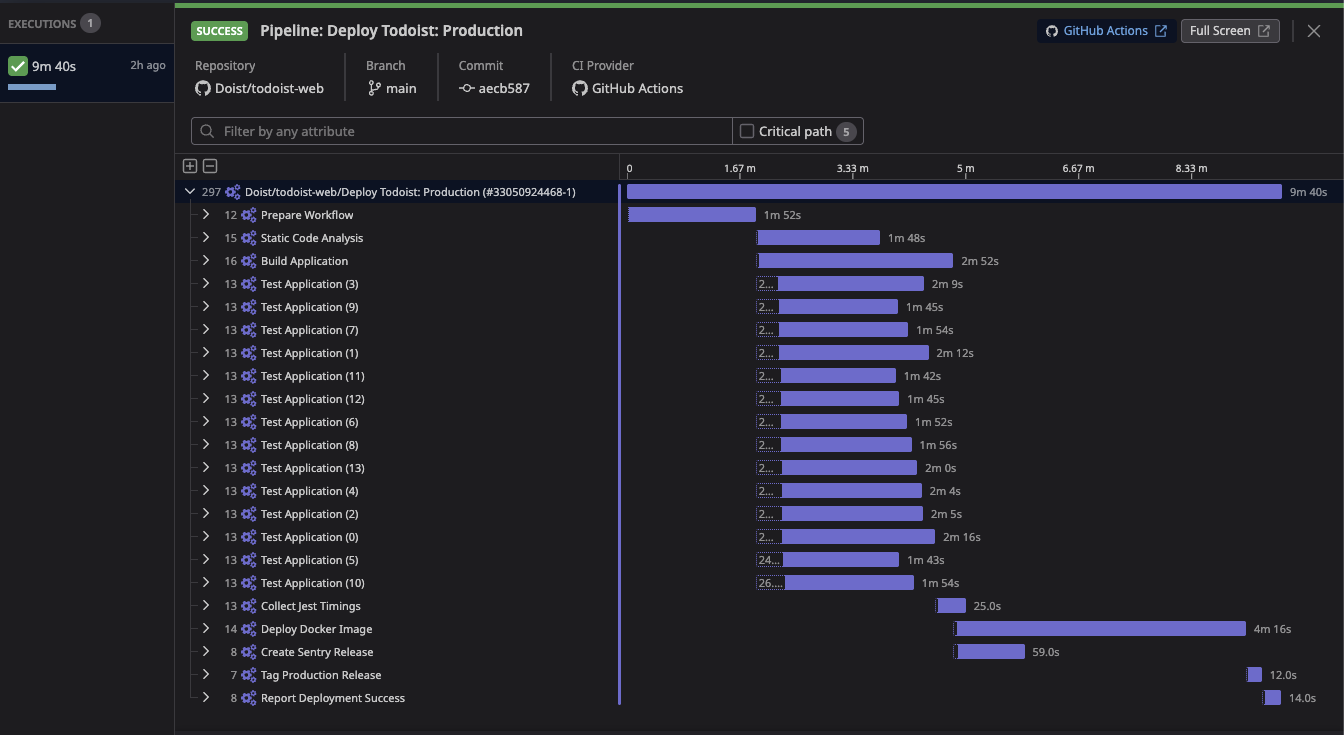
In the screenshot above you can see Datadog’s flamegraph view of a pipeline broken down into the jobs that run inside it. We used it extensively to identify slow jobs and optimize them, and since it’s a per-run view, it was straightforward to test solutions as soon as they were pushed to a PR.
Granularity matters, but the trend matters more. Are the optimizations making a dent across many pipeline runs or not? To answer that we built a Datadog dashboard that aggregates the pipeline metrics into more visual, easier-to-read widgets.
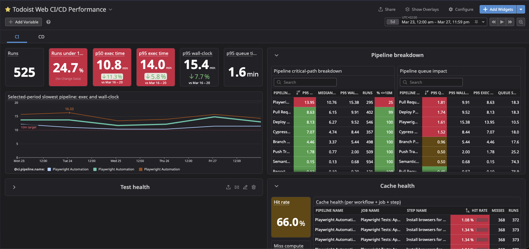
An implicit goal of this dashboard is that people outside the team, even non-engineers, should be able to open it and tell whether the pipelines are hitting their goals. The colorful, percentage-based widgets are an attempt at that kind of accessibility.
Compounding small wins
Looking back, the frontend pipelines did not need any particularly fancy solution to bring their times down. Compounding beat everything else: a stream of small optimizations that slowly tilted the trend lines downwards over the weeks we worked on this. Honestly, a bit discouraging at the time. It would have been so much easier if there had been one glaringly slow job to point at, or if those premium runners had followed the cost curve and cut the times in half. Instead, the waste hid in innocent-looking places: an S3 upload command, a checkout depth, a cache. A lot of time was spent figuring out how to reorganize jobs, splitting and parallelizing them, switching runner types, in order to shape the critical path into something that fits under the 10-minute goal. For every job, we asked:
- Is this job necessary, or can it be removed altogether?
- Can it be taken off the critical path? Is it something a PR or deployment really needs to wait for?
- Can it run concurrently with other jobs instead of after them?
- Would a different runner configuration, perhaps a higher-spec machine, give it the resources it needs to finish faster?
Even so, compounding aside, there were a few gotchas that caused time to be wasted:
-
Uploading the entire app to S3 on every production deployment. The build assets were pushed to the bucket that serves them with
aws s3 sync, which compares every object already in the bucket before uploading anything. In CI everything is freshly built, so it uploaded everything anyway. A plainaws s3 cp --recursiveskips the comparison and just uploads, which is fine since most assets have a content hash in their filename, so nothing gets clobbered. From ~6 minutes to 6 seconds, with two lines changed:- aws s3 sync ./build "s3://$BUCKET" + aws s3 cp ./build "s3://$BUCKET" --recursive -
Downloading 10,000 tags to read one version number. The deploy pipeline needs the previous release’s version to generate release notes, and used to get it by fetching every tag in the repository, 10,300+ at the time. Asking git for the tag names instead (
git ls-remote) does the same in a second or two, down from close to a minute:- git fetch --tags + git ls-remote --refs --sort='-version:refname' --tags origin 'refs/tags/v*' -
Cloning the entire repository history on every job. Some of our workflows were configured to check out the full git history of the repository (
fetch-depth: 0in GitHub Actions), probably copied from an example at some point and never revisited. For a repository as old as Todoist Web’s, that’s over 500MB and around 40 seconds per job, and none of those jobs needed more than the last commit. -
A job whose only job was to decide whether to run another job. On PRs we only run the unit tests affected by the changed files, and that “is anything affected?” check lived in its own job. Booting a runner and checking out the repository to answer yes or no cost 70 seconds on a normal day and up to 3 minutes on a busy one. The check now runs as the first step of the tests themselves.
-
A cache that was slowing down the builds it was meant to speed up. A deploy workflow kept a Docker layer cache to skip a 45-second dependency install, and uploading that cache took 1 to 4 minutes on every build. Deleting the cache took the build from close to 7 minutes to about 3.
None of these were optimizations per se. We just stopped doing work that didn’t need to happen in the first place. “Does this need to happen at all?” turns out to be a good question to ask about every step in a pipeline.
One run proves nothing
Of course, not everything came down to a misused tool or unnecessary work. Several optimizations required experimentation to uncover patterns that weren’t obvious at all. When in doubt, our approach was to experiment directly in CI. Running things locally works for quick feedback, but machine specs, network conditions and runner pool contention all make local results translate poorly to CI.
Take test suites as an example. The Todoist Web app has two kinds of tests: unit tests running on Jest and end-to-end tests running on Playwright. Tests are one of those tasks that can be split into smaller chunks that run in parallel, but test runners also support multiple workers on the same machine. So how do you balance same-machine workers, parallel CI jobs, and machine specs (vCPUs, RAM, storage)?
With an infinite budget, maxing out everything would probably be the fastest option. Money doesn’t grow on trees, though, so as with everything else it’s a balancing act between cost and configuration.
For situations where several scenarios need to be compared, we found that preparing dedicated benchmark PRs worked great. We altered the PR pipeline to run experiment jobs with different configurations side by side, all within a single pipeline execution, and then compared them in Datadog’s pipeline view.
This kind of head-to-head experimenting gave us insights that would have been lost had we just bet on a single configuration, and it saved a lot of the time we would otherwise have spent deploying one strategy, tracking its runs, comparing them with the previous ones, and iterating again.
A few of the things we learned this way:
- Unit tests love same-machine workers, browser tests don’t. Jest scaled well with workers on a single bigger runner, so it was cheaper to give it more cores and cut down on parallel jobs. Playwright went the other way: each worker is a full browser and wants a couple of vCPUs to itself, so headroom per worker beat packing workers onto a machine. Two workers on a 2 vCPU runner pinned the CPU at 100% and started flaking; the same two workers on 4 vCPUs ran clean. Splitting the E2E suite across 4 such runners ended up 28% faster than the previous 6 smaller ones, at the same cost.
- Shard based on duration, not name. Our unit test shards were split alphabetically, and the heaviest one had over 5 times the work of the lightest. Since the slowest shard is the one everyone waits for, packing test files by their recent run times evened them out for free.
- Settings tuned on a laptop don’t survive CI. A build step had been configured with 4 worker threads because that was fastest on a 10-core MacBook. On a 2 vCPU runner it was the slowest option we tested, and a single worker won by more than 30 seconds.
- Other teams’ benchmarks don’t transfer either. ARM runners cut our backend team’s Python test times in half. On our browser tests they were 30-40% slower, so we stayed on x86.
- Bigger isn’t always faster. Moving E2E to fewer 8 vCPU runners looked cheaper on paper, but Ubicloud’s pool of those machines was small enough that jobs sometimes waited 3 minutes just to get one.
Green ≠ Healthy
With flamegraphs burned into our eyes, we reached the tail end of the work with most CI pipelines finishing in single digits, but with the gut feeling that there was more to squeeze. On PRs, the remaining offenders were the end-to-end test jobs, which still took longer than 10 minutes every now and then.
At this stage, the data in Datadog wasn’t much help anymore. The pipeline looked well optimized, with no low-hanging fruit left. It was only when looking at individual test run logs in GitHub that we noticed that, although the jobs were passing, tests were often being retried because of flakiness. Extra latency that you can’t pin down just by looking at the runtimes.
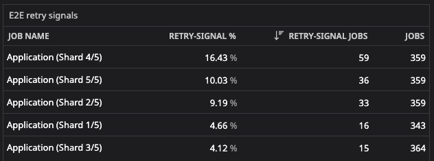
Looping back to the mantra of measuring first, building a baseline, and only then optimizing, we extended the Datadog dashboard with a widget that tracks retry signals in each parallel test job (shard):
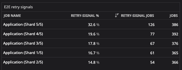
Not only did every shard have retries in more than 10% of its runs, but one of them was retrying on every third run on average.
The signal comes from Datadog’s test-level instrumentation of our Playwright runs, which marks any job that contained an automatically retried test. These are retries of individual tests inside jobs that still went green: the job passed, just slower, since our suite retries a failing test up to 2 times.
This led us to a side quest: a bot, running on GitHub Actions and triggered from a Datadog workflow whenever new flakiness is detected. That’s a story for another day, but in short, the bot creates a GitHub issue to track the flaky test, triages it with the help of LLMs, prepares a fix, and notifies the team.
With this more proactive stance on E2E flakiness, and the fixes the bot made easier to land, we saw retries drop in the weeks after it was deployed:
It has been operational ever since.
Lock it in
After hitting the objectives, we could have kept digging and tried to squeeze the durations even further. It would have been hard, but probably possible. It’s also diminishing-returns territory. Looking at recent numbers, the PR pipeline is well under target at 8.6 minutes p95 execution time, down from 14.5 minutes just a few months ago, a 40% improvement.

Production deployments are stable too, at 9.4 minutes p95 execution time, an even starker contrast with the initial 21.7 minutes.

With the goals hit, our attention shifted to making sure this work doesn’t get lost as the codebase and the deployment processes evolve. We built Datadog monitors that track the p95 execution time of PR and production deployment pipelines and send an alert whenever it crosses the 10-minute mark over a 2-day rolling window.
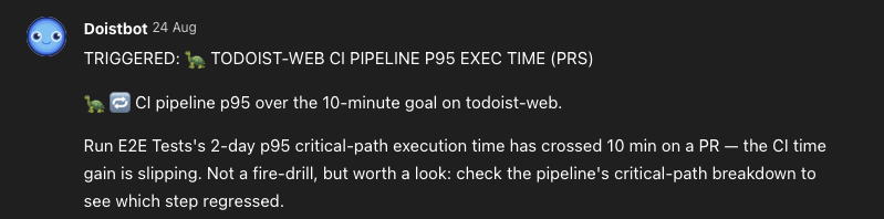
We’ve received a few alerts since they were set up, and so far they have all resolved without intervention, most often because a temporary infrastructure outage skewed the metrics. We keep an eye on them nonetheless.
Wrapping up
Since Todoist Web’s CI got its feedback loop back in shape, we’ve documented what we learned and applied it to other Todoist projects, with similar results. Our Android, Apple and backend colleagues went through their own version of this quarter, and their stories will be told soon.
Seeing the goals we set being met across projects is deeply satisfying, but the real long-term win is the foundation left behind: a dashboard anyone can read, regression monitors watching the goal metric itself, and the habit of settling optimization arguments with benchmark PRs instead of hunches. The single-digit minute mark we set is somewhat arbitrary; it simply felt like an acceptable wait for a developer to get a PR to green. But as technology evolves, and especially as agent-driven workflows take over, even tighter loops may be required to keep development from bottlenecking. That’s why having clear insight into the health of our pipelines, along with documented, methodical approaches to optimizing them, is what will let us keep scaling.
If your own pipelines are creeping past the ten-minute mark, our advice is to resist touching anything until you’ve measured. The slowest-looking job is probably not the one costing you the most.